Team Twins
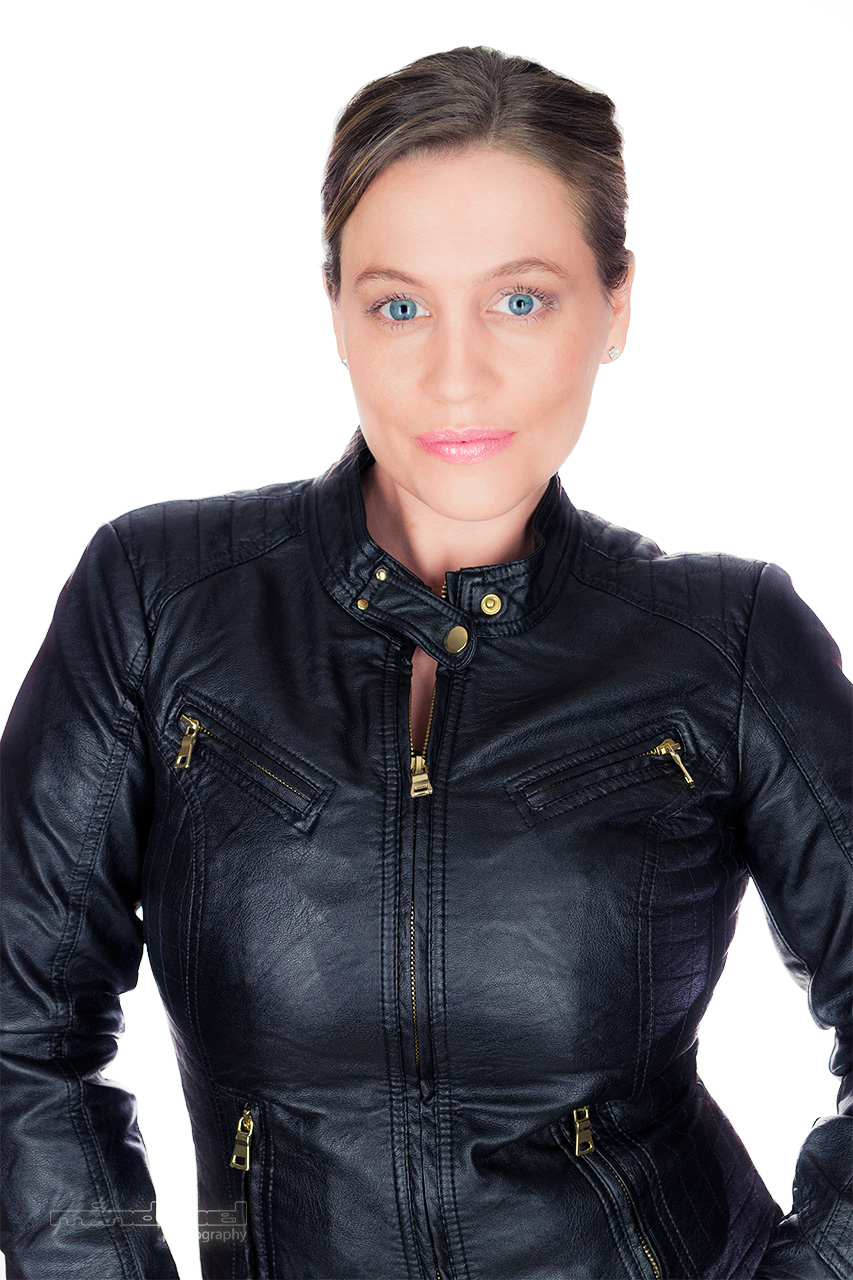
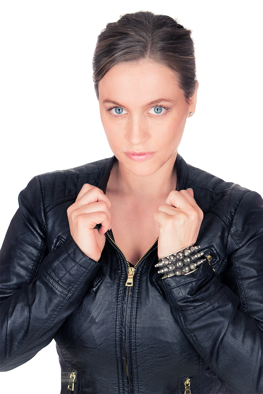
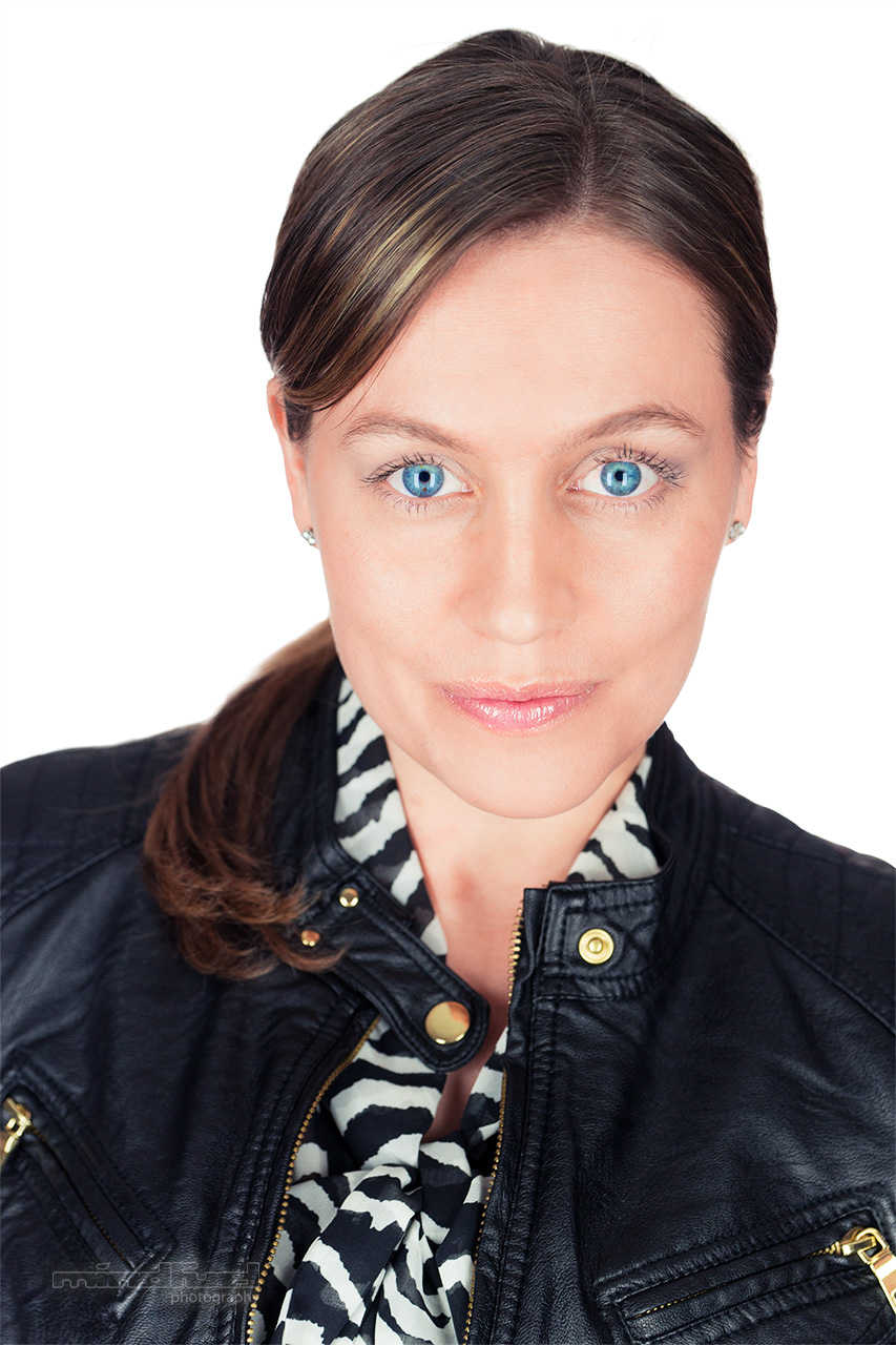
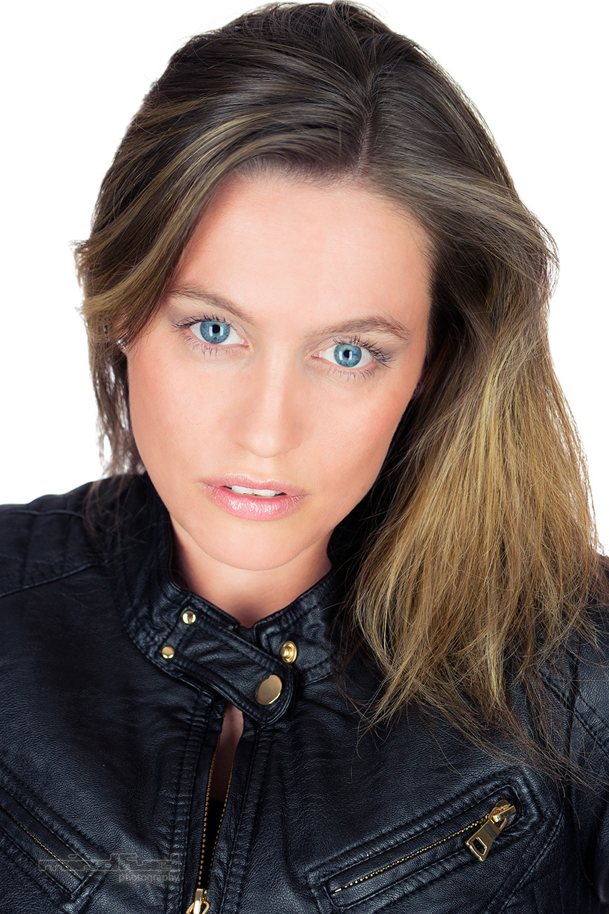
I had the great joy and opportunity to shoot Sam and Kailey Spear. The twin sisters are accomplished in acting, writing, directing, just to name a few and have founded their own production company called Black Spear Productions. The styling for the shoot was done by 47th Parallel North. The make up and hair artistry was executed by Shelley Leeder.
30% discount on a headshot-session for new actors/actresses/models
Please contact me now to book yours session today.
Fashion and Headshots with Amy
I had the pleasure to work with talented, lovely and beautiful Amy. The 10 year old model and actress from Alberta was modelling some clothes by Vancouver fashion designer 47th Parallel North.
Amy modelling clothes by 47th Parallel North
Cinemagraph: Dancer
Here is another Cinemagraph for your enjoyment. This was shot on Robson street in Vancouver.
How to do proper HDR images
On June 21st I went to sunset beach in Vancouver to take an HDR image of the beautiful evening sky. I've set my camera to shoot series of consecutive five bracketed exposures in order to create an HDR image in photoshop. After playing with tone mapping in Adobe HDR Pro I wasn't happy with the results but I have found this amazing tutorial on YouTube by EverydayHDR. Below is the image I was able to produce.
Solstice in Vancouver
Photo session with Sandy
Here are a few pictures from my recent shoot with awesome model Sandy.
What to show in online dating profile pictures.
Good pictures on your online dating profile can dramatically increase your chances to get an actual date. If you have ever wondered what kind of pictures you should upload to your profile please keep reading.
- Show at least a few pictures in which your face is in focus an clearly visible. Medium wide shots that show your face and your torso, while your doing something interesting, work best. It makes it easy for your potential date to see your body type and also see what kind of activity you are interested in.
- Don't just take and old picture of you at a party and crop everybody out or blur their faces. You should have at least one picture of you on your own.
- In most circumstances it is best to appear alone in the image. It can be very confusing for the viewer to figure out which one of the people in the picture is actually you. This rule especially applies if you are in a picture with a member of the opposite sex (for heterosexual relationships).
- Men should demonstrate pride and women should show happiness in their pictures.
- Women making a flirtatious face directly towards the camera get a higher chance of being contacted. Men have the best chance without smiling and looking away from the camera (according to OkCupid).
- Featuring drinking in your pictures is not a good conversation starter.
- If there is something really unique about your face like freckles or maybe a scar (eg. Harrsion Ford), don't try to hide it.
- Ask a friend or a professional photographer to take pictures of you but stay away from selfies taken in the bathroom through a mirror.
What is the future of Photoshop
Photoshop and the whole Adobe Creative Suite are invaluable tools for creative people in various fields. Especially the virtually seamless handoff between the different software packages makes it a pleasure to work with. Personally, I am a big fan of said tight integration. It's easy to quickly send an audio file from Adobe Premiere to Audition to clean it up, or open up a Photoshop document inside of Adobe After Effects to animate the individual layers. And that brings me to the biggest problem Photoshop is facing today and all other layer based image manipulation applications: the layer system. The layer system used in Photoshop is like a stack of paper, one on top of the other, seems to be outdated to me.
This is a node tree in Nuke.
The strict hierarchical structure doesn't allow for enough flexibility, versatility, manageability and speed for bigger projects. The layer system is fine for smaller projects with only a handful of layers but what if you have to balance twenty, thirty or even hundreds of layers? That's when you really need a node base approach to the problem. Nodes are like adjustment layers in Photoshop but with the benefit that you can connect them freely to other nodes, reuse them and even branch off into new logical constructs to achieve your final result. Nuke for instance, an application made by the company called The Foundry, is such a node based image manipulation application. Developed for the demanding visual effects environment, mainly used in post production for film and TV shows, is perfectly suited to also do "photoshopping". It's a bit overkill to use such an elaborate application for "just" photo use but it's possible. The learning curve might be a bit steeper than with Photoshop but once you get the hang of it, you will realize the real power of a node based system (see picture).
In order for Photoshop to stay relevant, it needs to change it's paradigm form a layer based to a node based approach. I am not saying it has to abandon the layer based structure all together but it should offer the possiblity to also work with a node based setup.
I would love to hear your thoughts about this topic, so please leave a comment down below .
Cinemagraph: Triplets
Enjoy! Please check out all my other Cinemagraphs here.
Triplets
What is a casting agent looking for in a headshot?
- The headshot has to be in color. Black and white images are outdated.
- You should look like yourself on a regular weekday.
- Keep your make up and styling to a minimum so it doesn't call attention to itself.
- The picture shouldn't be cropped too tight. It's okay to crop the head at the top slightly but some of the torso should be visible.
- Your headshot should be taken at eye level to create an honest and undistorted look.
- Keep your hands away from your face. Your face should be the "star" and nothing else.
- 8x10 is the industry standard size for headshots (preferably portrait orientation).
- Staple your resume on the back of your headshot in all four corners (back to back).
- Your headshot can have a border or it can be full bleed, it doesn't matter.
- You should look confident and inviting.
How to look good in photos
- Try not to focus too much on how you look. Do you ever really focus in your everyday life on how your face looks like at any given moment?
- It's important that you avoid a double chin, therefore try to move your forehead towards the camera in order to elongate your neckt and getting rid of a double chin and wrinkles on your neck.
- Make direct eye contact with the camera.
- Angle your head slightly to hide asymmetrical features of your face. The left side of the face is for most people the better side.
- Squint very slightly to give your expression confidence.
- Unless you have naturally a great smile that comes effortlessly while being photographed, it's better not to smile at all, relax your jaw and keep your lips soft.
Check out Peter Hurley's video and hear him talk about squinting/squinching:
http://www.youtube.com/user/peterhurleyphoto
How to take better head shots?
One of my favourite photographer and educator is Peter Hurley. When you hear him talk about photography, clients, techniques, lighting, coaching etc., you can sense honesty and sensitivity in his words that make him so intriguing.
Below is a list by Peter Hurley on what to look out for to improve your head shot photography and please check out his website http://peterhurley.com.
1. Headshot photography isn’t about a white background or fancy lighting. It’s about the person’s expression. If they’re sharing a genuine smile, that’s a good photo.
2. Keep the camera at eye level. That’s the most honest, genuine way to photograph.
3. Your job is to make the person feel good about the way they look. That’s not as easy as it sounds.
4. Teamwork is key. Don’t let the person think they’re interacting with a hunk of metal and glass. You need to work together, person to person.
5. As Bill Gove said, “Professionals are at their best regardless”. If you’re doing a shoot, you’re the professional. If someone’s nerves or expression start hitting the fan, don’t freak out. That’s when you’re at best.
6. Don’t look down at your camera between shots. Don’t even talk about tweaking settings. The moment you divert attention to the camera or your technique, you’ll intimidate the client and lose them.
7. “If I had 4 hours to chop down a tree I’d spend 2 hours sharpening my axe” said Abraham Lincoln. Photographers, your technique and setup should be completely sharp. Photograph friends and families for free to sharpen your axe. Don’t do a paid photo shoot until your axe is sharp.
8. Don’t shoot on burst mode. If you’re on burst you’re trying to get lucky. Also, 10 photos that are exactly the same are a pain in the edit. The client will want to see them all.
9. Jaw line is key. It should be sharp, because that brings out the shape of their face. To sharpen it, get the person to tilt their head forwards 2 or 3cm. Don’t make them look like a pecking chicken, but try to accentuate the jawline.
10. Retouching isn’t about removing wrinkles and lines. Keep your retouching to a technical level. Fix lighting and colours, but don’t try and make the person look 12 years old.
Are you shooting in manual mode?
There are a lot of articles about if or when you should shoot in manual mode. I would like to settle this issue once and for all with the following guide lines.
If you own a regular DSLR camera you should be shooting in either aperture priority mode or shutter priority mode. If depth of field is important, shoot in aperture priority mode. If freezing the action or blurring the action is important, shoot in shutter priority mode. If you own a camera that is always in live mode like the sony a77 or a99 you could be always shooting in full manual mode unless you have to be extremely quick taking a shot. In that case the earlier mentioned strategies apply.
Full automatic mode rarely gives you what you really want, however if you are shooting RAW you will have lots of leverage to correct your images to your liking later. It's always best however to get as close as possible to the result you want in camera instead of in post.
Happy shootin'!
Ken Rockwell
If you have never visited Ken Rockwell's website before it's about time you click the following link: http://www.kenrockwell.com
Ken is probably one of the sanest persons out there when it comes down to photography and gear. His opinions on those topics are razor sharp and to the point. Go check out his content and see for yourself what I mean.
Ken's reviews are beyond megapixels and tech BS. He cares about the results only and not the specs and that's exactly why he is so refreshingly different then the rest.
Cute characters wherever you look
During my recent trip to Japan I've noticed cute characters almost everywhere. Even prohibition signs are turned into characters. There are little bears, cats and fantasy creatures on countless ads and signs. In the picture below you can see the characters I have encountered on my endless walks through the streets of Tokyo and Kyoto.
These are the funny, cute characters I have encountered in the streets of Tokyo and Kyoto
Another Cinemagraph for your enjoyment...
My DIY Kino Flo
If you are like me and don't have the cash to buy a couple of Kino Flos but still want to get a similar effect for your portrait photography, you should consider making your own lighting kit for under 300$.
The following YouTube clip by Joe Edelman inspired me to do it. Please give his video a thumbs-up.
In the picture below you can see what my setup looked like once I finished putting everything together.
Here you can see the finished lights put onto simple light stands.
And the following picture shows all the things you have to get from your friendly neighbourhood hardware store:
At this point I want to give my friend Andy credit for helping me out with the electrical side of this project and teaching me new skills in wiring up a fixture like this. Without him I couldn't have done it (because I am just a pixel pusher with a big mouth).
After everything was put together and working I had the pleasure and opportunity to take some stunning pictures of talented fashion designer, actress and entrepreneur (47th Parallel North) Daniela Reiser.
